Week 11 - UI/Polish
Initial Implementation
This week's focus was on UI and polish. A lot of my time was spent getting the new level select screen working alongside the new difficulty selections, and the graphical elements associated with this screen. Even more time (I don't want to admit how long) was spent trying to get the WebGL build of the game running properly as the level select menu was not behaving as expected - refusing to display the correct player progress for each difficulty, and not loading a level when clicked on among other things. The fix was ultimately very simple: loading a persistent scene which handles a whole bunch of the inner workings of the game which was missing... Too bad I didn't realise earlier and went down a rabbit hole of bug hunting to no avail.
The main features added in relation to the UI and polish include:
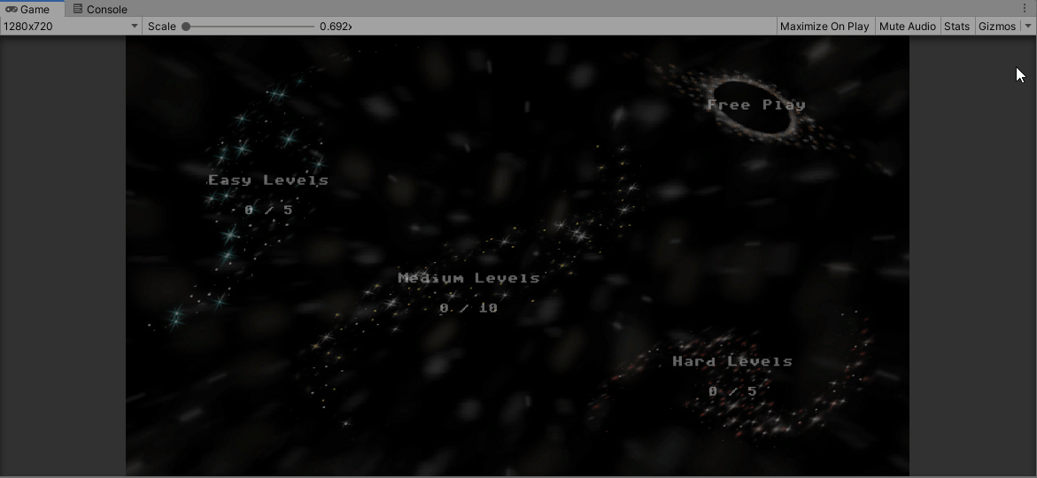
- Level selection screen
- With new background image
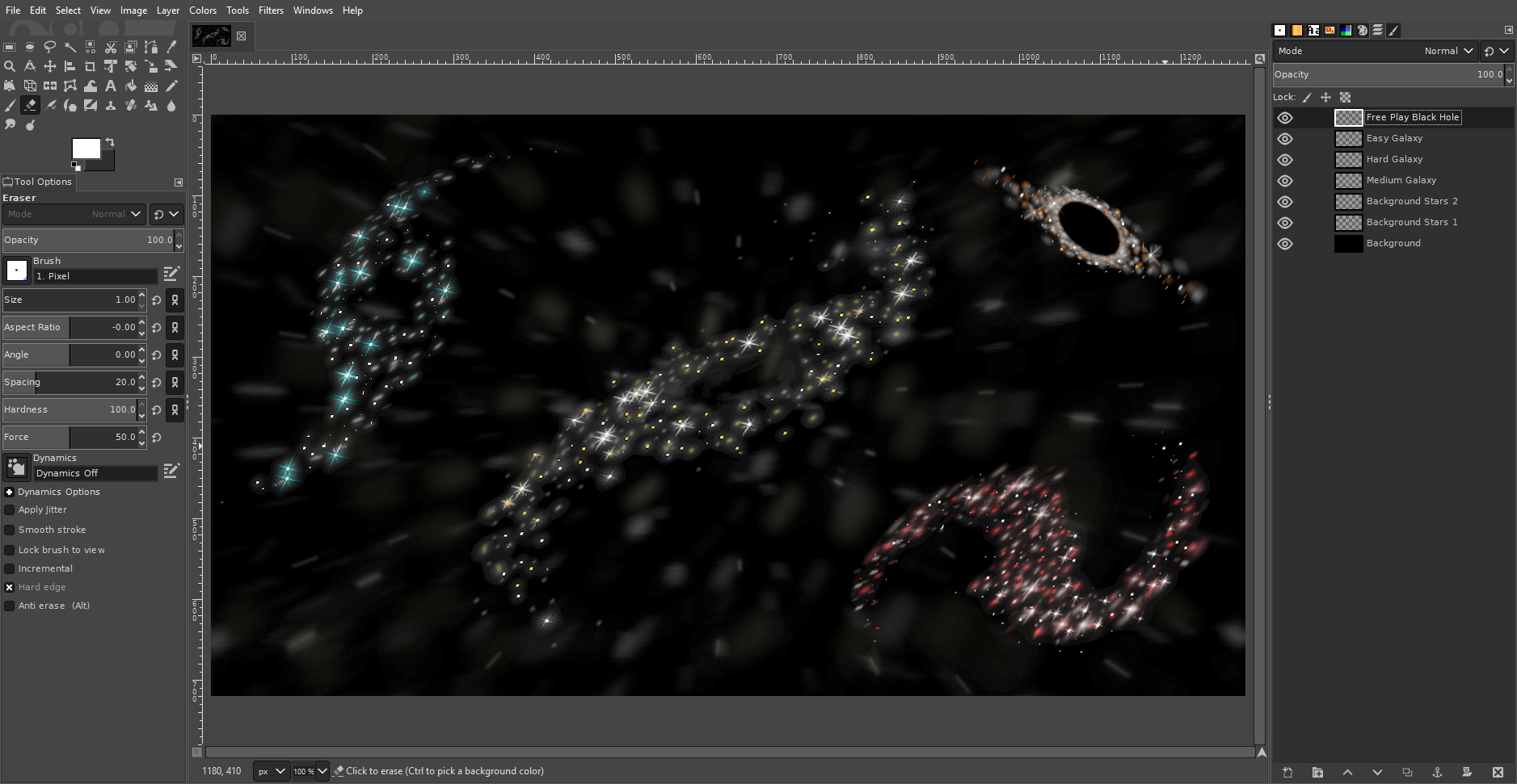
- With 4 separate sprites created to represent the different galaxies
- With text at bottom of screen offering description of each category of level
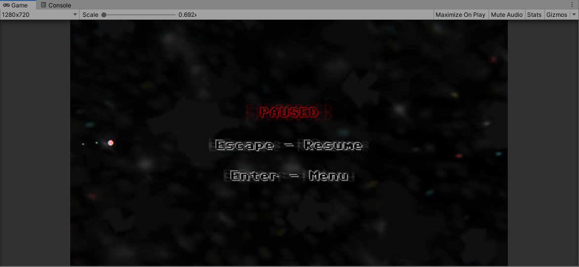
- In-game pause menu with options for quitting to menu and resuming
- Four types of levels with player progression tracked:
- Easy (less obstacles, weaker force fields and no missiles)
- Medium (more obstacles, stronger force fields, slow-spawning missiles)
- Hard (even more obstacles, even stronger force fields, faster spawning missiles)
- Free Play (detailed below)
- Free Play mode
- Endless stream of levels
- Randomly placed obstacles (as usual)
- Random quantity of each obstacle per level (unique to Free Play mode)
- Random force field strength from none to 3 hits (widest possible range, unique to Free Play mode)
- Random missile spawn rate per level (unique to Free Play mode)
From quite early on I knew that I wanted the level selection screen to be something interesting, rather than just plain buttons and text. The idea was to have colour-coded galaxy sprites which served not only as buttons but also as visual representations of where the player is going to. Now that it has been implemented, I am quite happy with how it turned out. I feel that the current state of the level selection screen looks even better than the initial concept art.
The in-game pause menu was actually an afterthought rather than an intended feature. Whilst playtesting I realised there was no way for the player to exit back to the menu unless they completed every single level in the group, at which point they would be brought back to the selection screen. Implementing this was pretty simple, all I had to do was change the time scale to 0 (slowing the game down to a halt) and load a simple menu scene which displays the options.
The three difficulty levels were not too difficult to implement either. Before, I was able to determine the contents of each level by entering values into the inspector within unity. Now those values are split into 3 separate groups of values, and are accessed only when the appropriate difficulty has been selected.
Other features include:
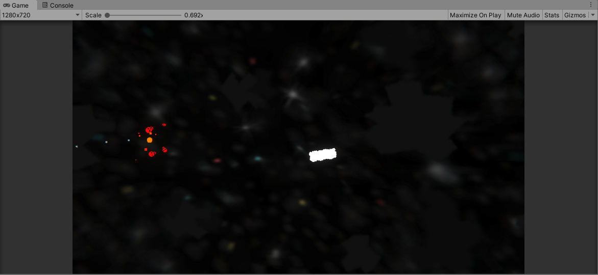
- Added "Deathball" powerup, which allows the player to smash through any obstacles at any speed (except for the large rocks), and destroy force fields immediately upon impact. This is a very powerful ability, as it allows the player to bypass both obstacles and force fields, making for a guaranteed win provided the player can successfully navigate to the end.
- Added new skull particle effect for the Deathball powerup (I find it amusing).
Player Feedback
There wasn't really a formal testing session this week, which ended up being an advantage for me as I used the extra time to work on more features. I did still received some feedback however. In terms of the art style and visuals, I received some positive comments which indicate I am going in the right direction when it comes to the graphics - this is especially useful to me, as I've been wondering if the art is consistent enough. It has also been indicated that the menu looks good, which I am also glad to hear considering the time I spent making the graphics.
An interesting point made was the lack of title screen, and its requirement as part of the Assessment. I had remembered to make a title screen of some sort, but never ended up implementing it as I got all tangled up in getting the WebGL build working. At the moment, my intentions for the title screen is a simple separate scene displaying an updated version of the game cover image (with the asteroid about to hit the planet) and the text "Press Space" on screen.
Leave a comment
Log in with itch.io to leave a comment.